CaaS
Branding
Global Creative Support
How to Choose the Right Type of Print Document
When it comes to print, the format matters just as much as the content. The type of printed material you choose sets the tone before a single word is read. And yet, it’s often an afterthought. At Epigram, we help clients shape everything from beautifully structured brochures to placemats, posters, and eye-catching foldouts. Here’s our guide to choosing the right type of print document for the moment.
Lucy Taylor
09/03/2026
Why print still matters
In an increasingly digital world, print has one major advantage: it slows people down.
A well-considered print piece invites your audience to engage with your message on their own time, without screen fatigue or digital distraction. It can be an incredibly useful tool in the modern day and age. But to make it work, the format needs to suit the message.
Often, we see content crammed into the wrong structure, flyers overloaded with text, booklets handed out where a simple foldout would do, or designs that lose visual impact because the format doesn’t support the content.
Choosing the right print structure is where good design begins.
Start with your purpose
We always begin by asking three questions:
- What do you need this to do?
- Who is it for?
- How will it be used or shared?
The answers usually guide the format. A conference handout that needs to grab attention from a distance will need different treatment than an internal rollout piece designed for quiet reading. A student browsing graduate opportunities wants clarity, not a dense booklet whereas a senior partner at a pitch meeting may expect something more refined and structured.
Below, we’ve outlined a few of the most common formats, and when to use them.
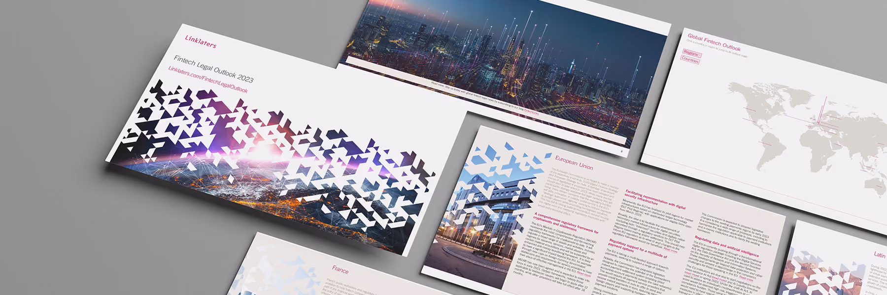
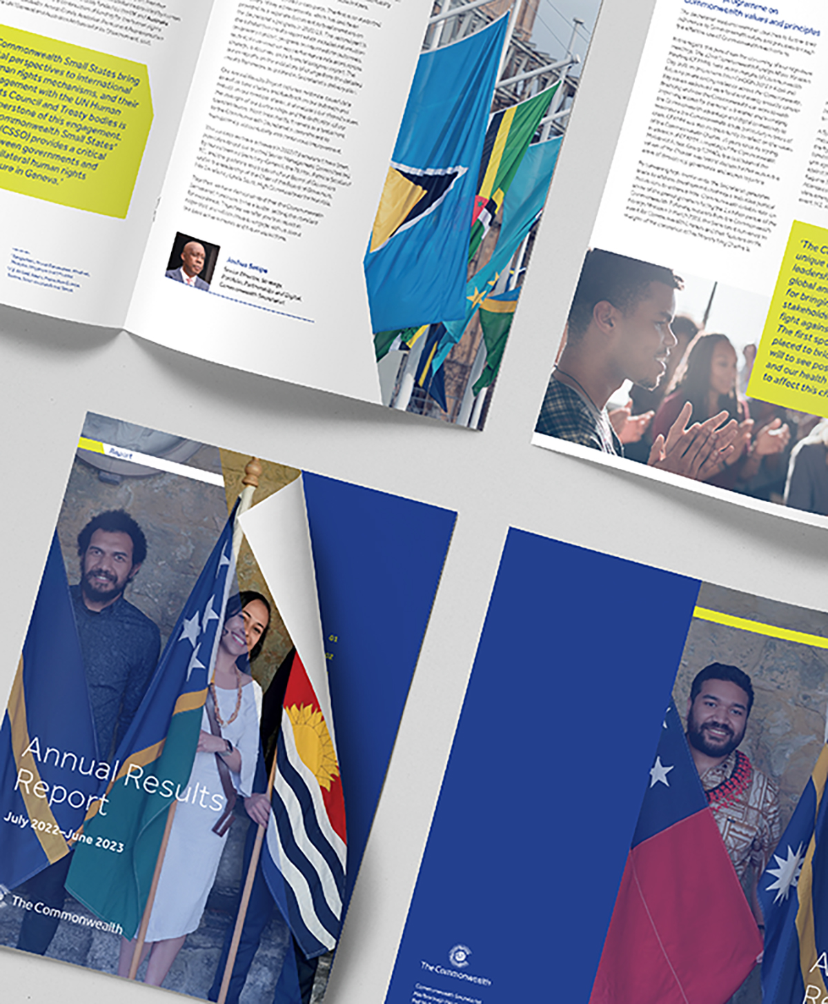
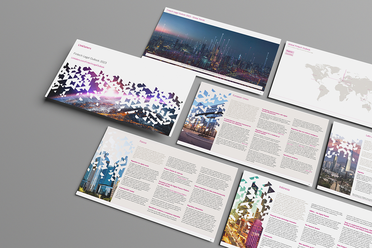
Brochures
Best for: Conferences, investor packs, client leave-behinds
Brochures are the go-to format when you want to communicate a clear message across multiple sections. They’re ideal for structured storytelling, showing progression, or taking a reader on a visual journey.
But they don’t have to be bulky or traditional. We design everything from slimline A5 brochures to statement pieces with bold layouts and modern finishes. Often there feels like a lot of pressure for clients to fit their content onto a small A4 piece of paper purely because of the misconception that fewer pages mean people will be more likely to read it. However we know that a well spaced out and beautifully designed booklet can grab far more attention than a text heavy A4 bochure.
What makes them work is thoughtful content structure and pacing. We often recommend taking the quantity of text and images into consideration, and remembering that space to breathe in a design is vital to ensure readers don't feel fatigued by overwhelming content. That being said more pages doesn't mean more impact. A well-designed 8-page piece will land better than a bloated 20-pager
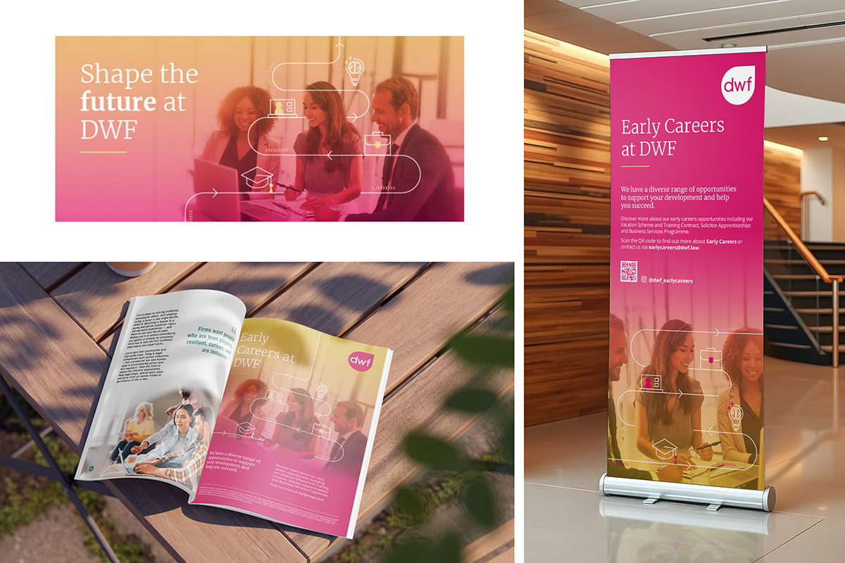
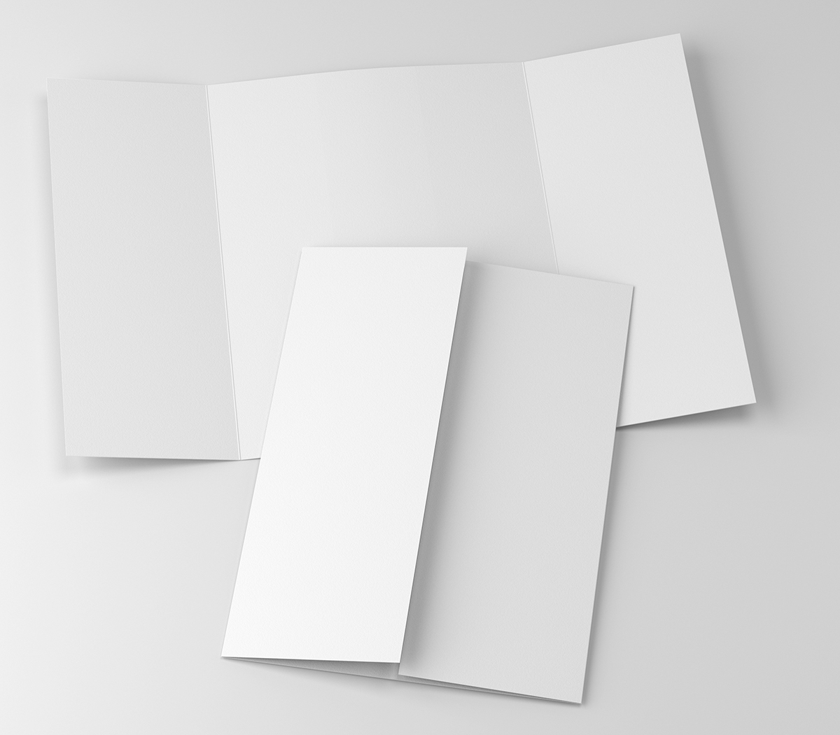
Gatefolds and Trifolds
Best for: Recruitment materials, event promos, modern leave-behinds
Foldouts are perfect when you want something tactile, compact, and a little more dynamic than a standard flyer. A gatefold gives you the space to make a bold first impression (with a strong front cover) and hold the detail inside, creating an experience as the reader opens it out. A trifold allows content to be broken up into sections and allows an easily portable document that people will find easeier to keep wiht them until they have time to digest the content.
They're especially useful when you're trying to simplify complex information into digestible, high-level takeaways. For younger audiences, like students or early-careers applicants, foldouts feel modern, scannable, and less intimidating than full brochures.
They're also cost-effective and highly portable, easy to distribute at events or send by post.
Placemats
Best for: Conference tables, roundtables, internal launches
Placemats are a subtle but powerful format. They work well when your audience is seated and you want to provide messaging that supports the conversation without interrupting it.
We often design them for use at law firm roundtables or leadership sessions: a one-pager with key facts, diagrams, or prompts that spark thought without demanding attention.
Visually, they allow for strong brand moments, especially when paired with printed folders or takeaway pieces. They’re a great choice when you want a clean, elegant way to support spoken content. But keep in mind that these are likely not going to be taken out of a meeting room, if you want a take away document brochures or small booklets feel easier to carry away and often seem more sturdy.
Posters and Large Format Print
Best for: Event signage, awareness campaigns, internal initiatives
Posters work when clarity and impact are the priority. We design them for event environments (from recruitment fairs to high-profile conferences) as well as internal firm campaigns, supporting launches, values rollouts, or awareness initiatives.
What matters most here is simplicity. Posters aren’t designed to say everything. They’re there to stop someone in their tracks, deliver a message, and encourage action.
Often, they work best when paired with supporting formats. For example, a poster that drives readers to a QR code, a placemat with more detail, or a follow-up digital piece.
What to avoid
We often see clients default to familiar formats like A4 flyers or overlong brochures, without considering whether the design suits the content. That can lead to missed opportunities, especially when:
- Flyers are packed too full and become unreadable
- Booklets are used where a simple foldout would feel fresher
- Audience needs are overlooked (e.g. a recruitment piece that overwhelms rather than engages)
The format should be shaped by your goals, your audience, and the occasion, not just by habit.
Working with Epigram
Print is still a huge part of what we do and we treat it with the same strategic care as our digital work.
Because most print pieces are one-offs, they’re often quoted bespoke however are included in some tiers of our Creative-as-a-Service model. That means we can tailor the design to your content, your goals, and your budget. We also work with trusted printers, so if you need production support, we can manage the full process from first draft to delivery.
Whether you know exactly what you need or you’re still exploring options, we’re here to help you make the right choice and bring it to life without the stress.
Contact us about a one off bespoke print job or join the many professional clients getting access to out creative as a service offering, with flexible, ongoing access to Epigram’s strategic creative support, all without quotes, timesheets, or per-deliverable costs. You still get clarity and structure, just without the hassle of admin overload.
We think you would enjoy some of our other insights:

 Elevating Legal Content Across Asia: How Epigram are Transforming Digital Communication with Foleon.
 Crafting a Stronger Legal Brand: How Epigram Helped Pannone Corporate Elevate Their Identity